
Chenkang Kenny Wu
Portfolio


Reimagine the iconic 1996 SpaceJam website, my mission was to meld its historic charm with contemporary design elements. I initiated this project with a meticulous usability analysis, preserving the essence of the original while infusing modern-day UI/UX practices. A full renewed experience was created after several testing and iteration.
Informed by my expertise in design and long hours comprehending user research, my direction for this project was steered by recreating a "space" for imagining the cosmos.
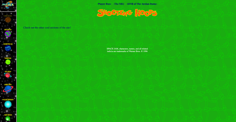
The 1996 SpaceJam website, while nostalgic, lacks alignment with contemporary web design standards and usability
By modernizing the website's design while preserving its foundational elements, we can create a user experience that appeals to today's audience without losing the nostalgic touch cherished by its original fans.
A galactic nexus website design that enhanced the tedious browsing experience with modern design principles.
An re-imagination of space age. Inspired by vintage space posters and gamified interaction strategy, the new space jam radiates invitation, welcoming visitors to explore and have fun without the hassle of getting lost or squinting their eyes.


Why the 1996 SpaceJam Website is a Timeless Gem.
The Dawn of Web Design
The SpaceJam website, in its original form, served as a promotional avenue for Warner Bros, tantalizing users with exclusive snippets about the film, intriguing them to delve deeper into its pages and, ultimately, to experience the film in theaters. The year 1996 witnessed web designers navigating uncharted territories, with user-centric design principles yet to be established.
"We loved our work, but it went largely unnoticed," recalls Weiss. "Many of my peers were yet to discover the wonders of the online realm."
Revisiting the Space Jam Website
To gauge the usability, design effectiveness, and emotional resonance of the original Space Jam website from a modern user's perspective, and to gather insights that would steer the redesign process. I conducted a usability test with three regular web users who may or may not be familiar with the original Space Jam and two ardent Space Jam fans who would bring in a nostalgia-driven perspective.
Judging a 1996 website with modern design principles.
Functioning on basic HTML, the SpaceJam website is a veritable treasure trove of the nascent internet era. The website lacks many strategies in delivery. Below are the design principles I will be focusing on implementing in this redesign.
3 major insights that surprised me
After 3 days of intensive research and putting users to test the original website, there are three interesting insights that I either did not anticipate, or gain further clarify on.


Directions for redesign
As I embarked on the redesign journey for the iconic Space Jam website, it became clear that the challenge was twofold: how to preserve the nostalgic charm that evoked fond memories for its users, while also infusing modern design principles to make it relevant and user-friendly in today's digital age.
Theme 1: Experience design
Users expressed their thrill at exploring each planet, reminiscent of a space odyssey.
Users felt nostalgia for it reminds them of how we imagined space travel will be like.
By keeping the main color palette and branding it is more likely enhance the website without losing brand consistency.
Theme 2: Content
If content is rewritten in the right tone of voice visitors are more likely to read.
Users are more engaged when they can quickly navigate to a part they want to read.
Visitors and die hard fans will appreciate the including of easter eggs to encourage exploration.
Theme 3: Design
Design should inherent a consistent brand voice of vintage space theme.
Strong visual elements and interactive interface can potentially increase user engagement and browse time.
Functional and responsive design minimizes drop offs due to frustration.
Cohesive and Contemporary Design
VINTAGE SPACE
In its initial iteration, the Space Jam website was a sprawling digital universe of 11 major pages with each hosting 4 to 7 subpages. This vast cosmos left users feeling lost amidst a maze of confusing labels. Therefore, I started of by redesigning the sitemap to set a good foundation.
Drawing inspiration from the imaginative and colorful realm of 1990s sci-fi art, a mood board titled 'VINTAGE SPACE' was conceived.


Cross-functional collaboration and rapid iterations.
Pushing functionality first before visual elements.
Paper wireframes serve as the skeleton for our digital interface, providing a tangible sense of flow and function before any heavy design work commences. After rapid feedback loop with users, I identify and develop patterns that stand out the most and transitioned into digital wireframes.


3 major improvements in design.
Here is were I admit I failed horrifically. Below are three major areas of improvements from high fid V1 to V2. I undergo five rounds of improvements with low and mid fid wireframes and one major iteration testing the high fidelity prototype.


View Figma File
Welcome to Jam Central – the beating heart of the Space Jam digital universe. The movie's narrative, the genius minds behind its credits, and its evolution from ideation to cinematic reality, are presented with a depth that's designed to quench even the most ardent fan's curiosity.
At a first glance, Jam Central might appear as a textual cosmos. But it's not just about the quantity or quality of information; it's about accessibility and engagement.

In today's digital age, site maps are often viewed as relics, reminiscing the nascent stages of the internet. But in the reimagined Space Jam universe, they are reborn, not merely as tools, but as modest space jam way of discovery.
No longer a static list of links, the new SITE STAION transformed into an intergalactic space shuttle UI that shoots you in the direction you wish to take.

where legends come alive! Every character from the iconic Space Jam universe gets their moment in the spotlight, captured through beautifully crafted interactive player cards.
The card-based design of the Rosters page is a deliberate nod to the collectible playing and trading cards of the 1990s, evoking a sense of nostalgia while staying firmly rooted in contemporary aesthetics.

The Space Jam universe is vast, with snippets of memories scattered across various media forms. Recognizing the need for a cohesive experience, I designed a central hub for all media content.

Every piece of media finds its rightful place. Whether you're looking to revisit Michael Jordan's cinematic slam dunks in video format, tap your foot to the infectious rhythms of the soundtrack, or simply immerse yourself in a photo journey of behind-the-scenes moments.

In a digital landscape dominated by mobile users, it's vital that the redesigned Space Jam site isn't just a visual delight on desktop but is also seamlessly accessible via mobile.
What we achieved and what's next...
84% of participants had an positive browsing experience.
Following the redesign, the Space Jam site saw a increase in user engagement, with a notable rise in mobile users, validating the success of its modern and mobile-first approach.
What are some next steps moving forward?
Throughout the course of the SpaceJam redesign project, I've gleaned significant insights into the delicate art of merging nostalgia with modern design principles. Crafting a site that could evoke fond memories, yet still meet today's rigorous design standards, was a profound learning journey. It emphasized the importance of understanding user needs and desires, recognizing that design isn't solely about aesthetics but about creating meaningful connections.
The usability study unveiled real pain points, guiding the design decisions and highlighting the importance of user feedback at every stage.
The successful marriage of past and present in this project reiterated that history doesn't need to be overwritten but can be beautifully repurposed with a fresh lens.
Moving forward, the next steps are clear. The SpaceJam site redesign has set the stage, and it's time to take it from static designs to dynamic experiences.


